Design Heist #004: How to use icons to skillfully (and beautifully) guide your users to information
Stealing from Dutch.com's masterful use of iconography
Hello, and welcome to a new issue of Design Heist. I’m Jonathan, and each week I infiltrate a beautifully designed website and share design advice, typography tips, and principles I’ve learned from them. Send me any questions and suggestions for sites to pick apart, and in return, I’ll feature them on future editions. 🤜🤛
If you want to receive new issues every week in your inbox, you can sign up below.
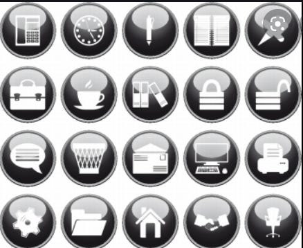
There is a (shameful) point in web design history that makes me cringe when I relive it. It seemed like everywhere I looked there were these WordPress Websites that seemed to have these same cheesy icons:
You know them. But thankfully… time passed, we ditched the heavy shadows and ventured into flat design. However, the generic crap remained:
3 boxes filled with some abstract icons that help little to convince the visitor that this service or product or whatever was for them. I mean really, who ever said: “You know, I’ve been on the fence about buying this $100 anti-virus software for a few months, it’s a big investment, but I have sensitive stuff on my laptop that I want to protect. I don’t really understand the product description, and the About page was meh, but…wait…what’s this…oh wow, what a glorious gear icon! They must be pros. I mean I’ve never seen this one before.” It’s so unbelievable I can’t finish typing it.
My point?
Icons aren’t usually effective at communicating that you’re a professional business that is knowledgeable in what they do.
BUT, they can, if you use them correctly.
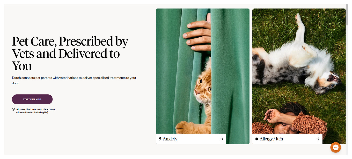
Which leads us to today’s Design Heist of Dutch, a pet-centered company that focuses on “Pet Care, Prescribed by Vets and Delivered to You”. These people get it right.
Let me say this. I don’t have any pets. But I really enjoyed browsing through their site, and if I ever do get a pet, I’ll surely remember this site before I ever remember Petco.
Let’s steal from Dutch.com's masterful use of iconography and learn about icon placement:
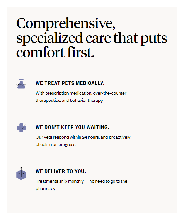
1. Icons in a grid
This is pretty predictable. It’s the amateur level of web design. Most people will put 3 benefits and a corresponding icon. It’s simple. It’s predictable. It’s boring.
But, I like how Dutch’s designer Changed it up. They use 2 colors instead of 1. It’s purple overlayed with black lines, which adds interest and a nice modern touch.
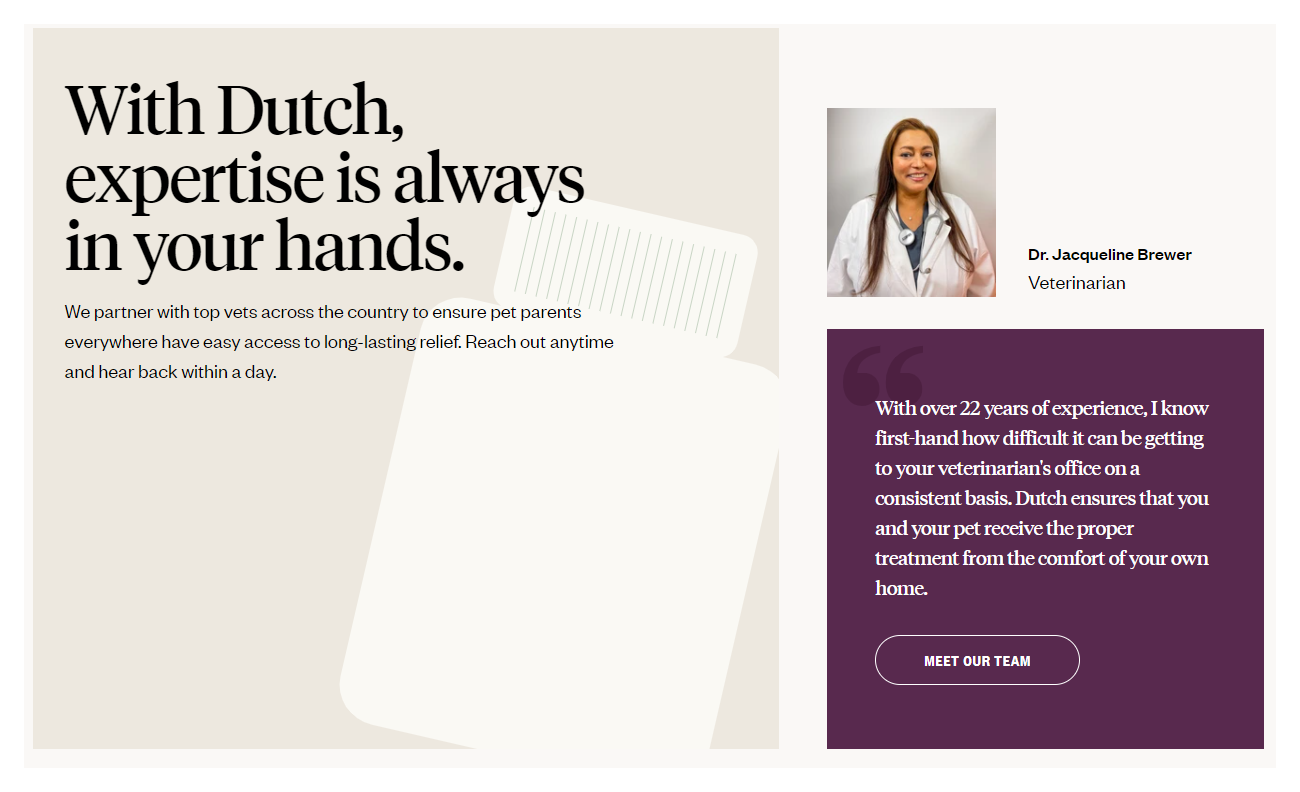
2. Icons in the background
Here’s where things get interesting. I don’t see many people doing this. What I DO see is lots of full-spread photos covering the background. But the slightly tilted med bottle adds some nice interest to the box while drawing the eye and guiding the reader.
3. Icons in Buttons
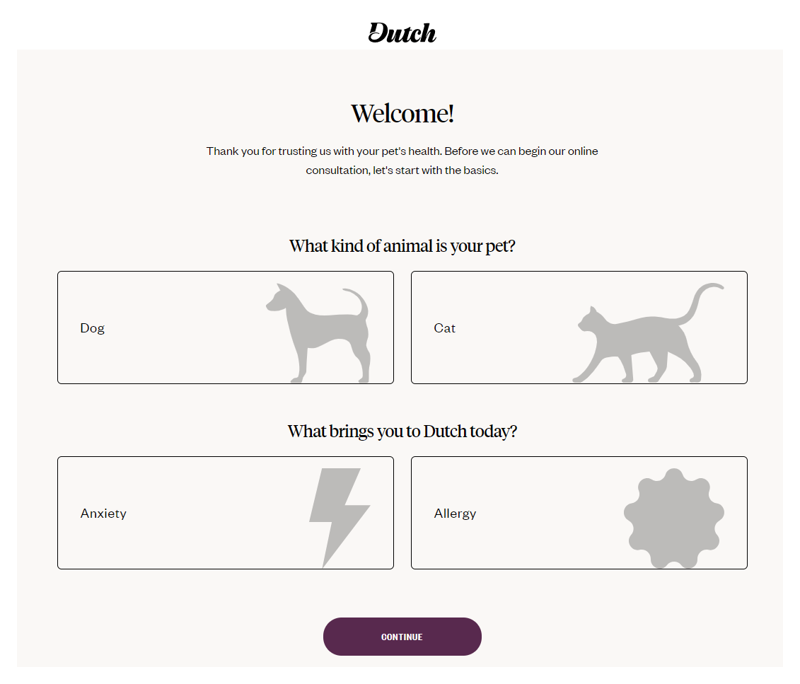
PRO LEVEL. The screen below is actually a screen that comes up once you try to make an appointment. I think the use of the cat and dog silhouettes was genius because they’re easier to process than the actual words “Dog” and “Cat”. My eyes were drawn to the icons and I could have easily have selected the correct button without even reading the words. And that’s exactly what every business wants: Quick and easy sign-ups, right?
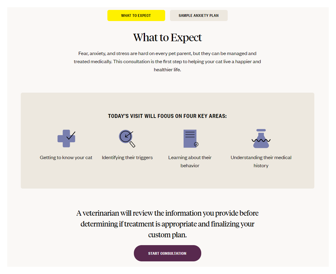
4. Icons that preview the visit
More grid here. But I like that instead of talking about benefits, which is what most people use icons for, they are using them to preview the pet’s visit.
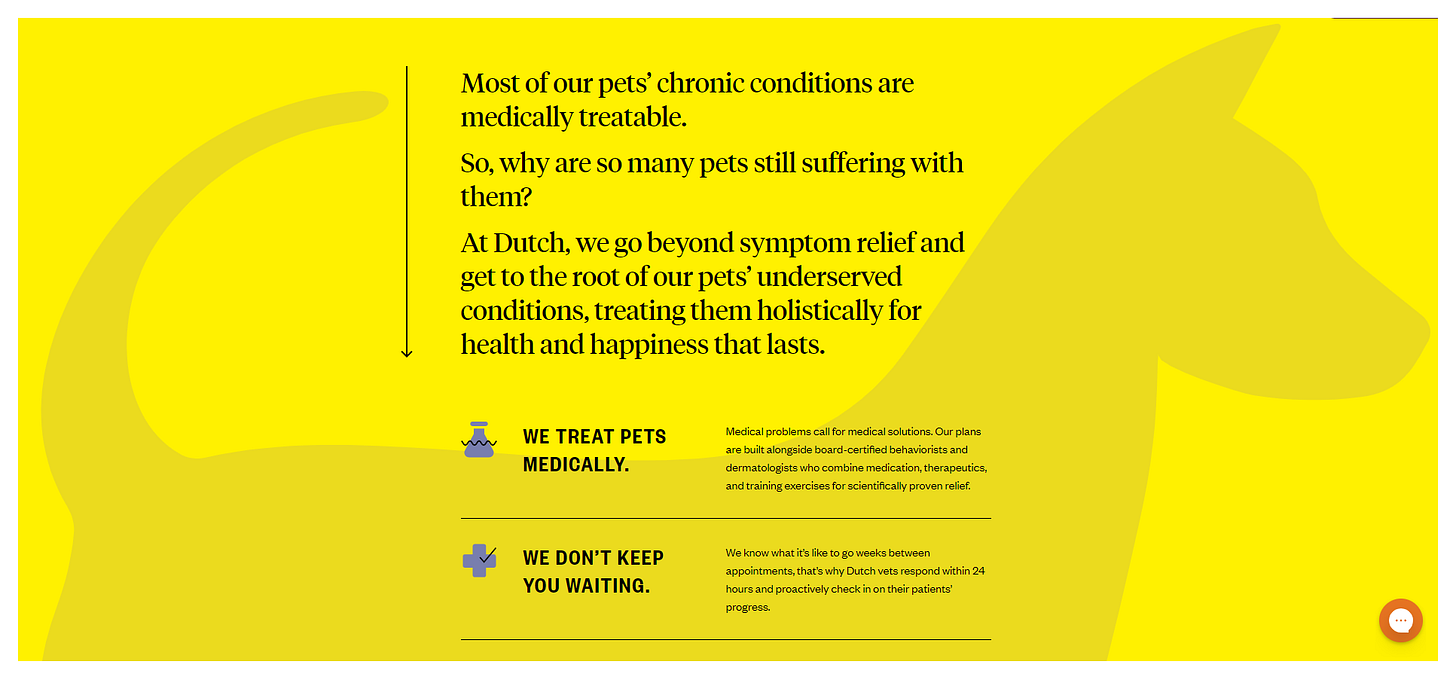
5. Icons in the background + Grid
Ok, this was delightfully unexpected. I’m not quite sure why I love this screenshot so much, but the dog icon in the back, combined with the smaller icons in the foreground is a great combination. This is PRO LEVEL ICON STUFF. And this is what you should be doing if you have real smooth icons like Dutch does.
Conclusion
Bruh. Are you using cheesy icons? Go pay someone for some new ones, and grab a few tips above. I guarantee your visitors (and your bottom line) will love it.
How are you using icons in your designs? Let me know by clicking/tapping the comment below and leaving a link for all of us to admire.
Design Thieves, see you on the next heist.
Jon


